Skip to content Skip to sidebar Skip to footer

How to Combine Streamlit, Pandas, and Plotly for Interactive Data Apps

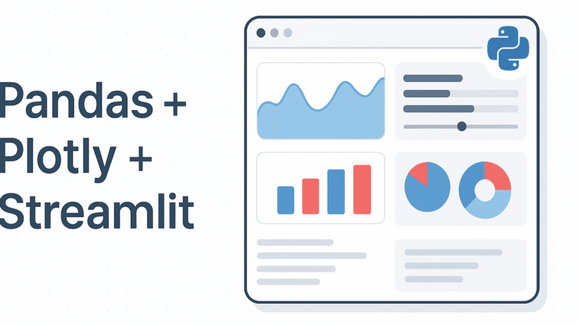
Image by Author | ChatGPT   Introduction   Creating interactive web-based data dashboards in Python is easier than ever when you combine the strengths of Streamlit, Pandas, and Plotly. These three libraries work seamlessly together to transform static datasets into responsive, visually engaging applications — all without needing a background in web development. However, there's…

Read More

Make Sense of a 10K+ Line GitHub Repos Without Reading the Code

Image by Author | Canva   Navigating and understanding large codebases can be challenging, especially for new developers joining a project or when revisiting older repositories. Traditional methods of understanding code structures involve reading through numerous files and documentation, which can be time-consuming and error-prone. GitDiagram offers a solution by converting GitHub repositories into interactive…

Read More

Forget Streamlit: Create an Interactive Data Science Dashboard in Excel in Minutes

Image by Editor | Midjourney   While Python-based tools like Streamlit are popular for creating data dashboards, Excel remains one of the most accessible and powerful platforms for building interactive data visualizations. Using built-in Excel's features, you can build an interactive dashboard that rivals popular data science web apps. In this tutorial, we will show…

Read More

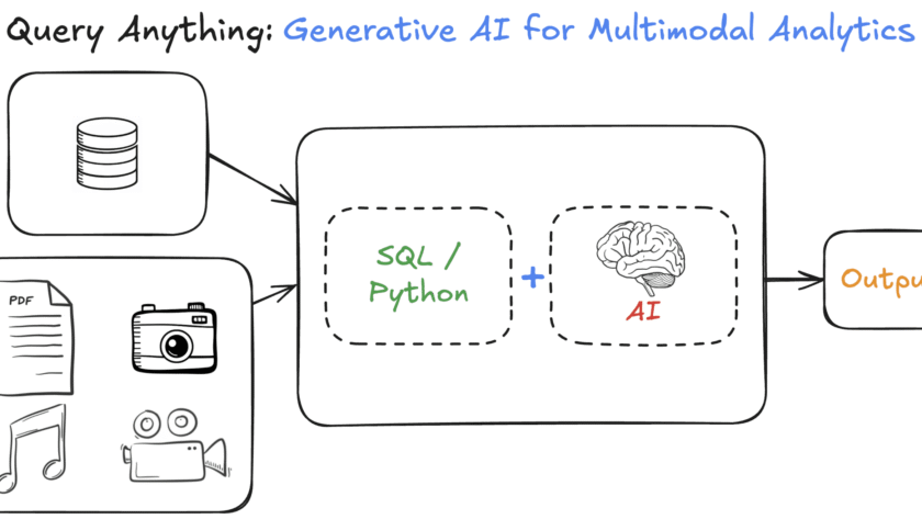
Unlocking Your Data to AI Platform: Generative AI for Multimodal Analytics

Sponsored Content       Traditional data platforms have long excelled at structured queries on tabular data - think “how many units did the West region sell last quarter?” This underlying relational foundation is powerful. But with the growing volume and importance of multimodal data (e.g. images, audio, unstructured text), answering nuanced semantic questions…

Read More